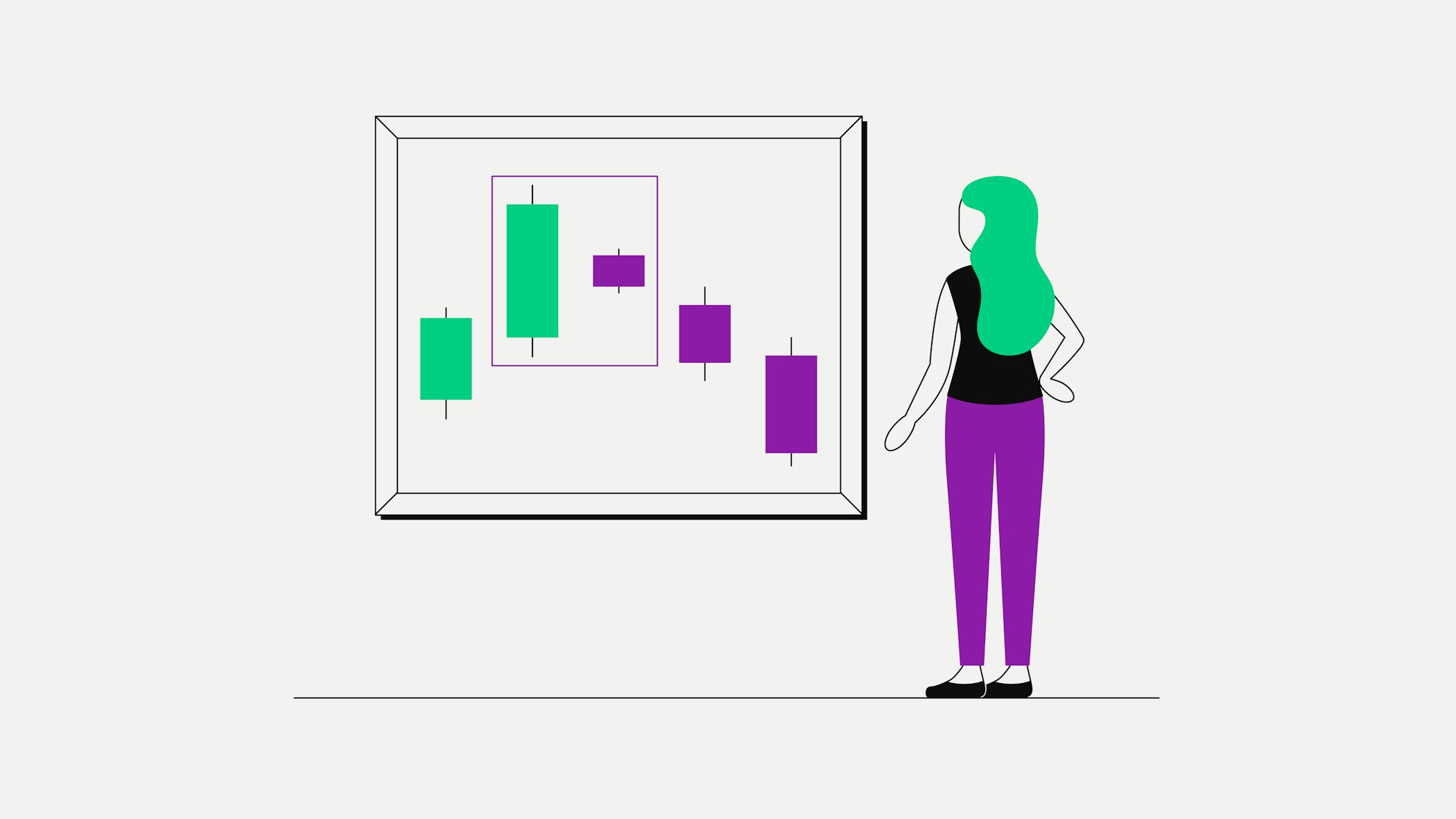
Bearish candlestick patterns you should know
Charting with candlesticks is probably one of the oldest tools for technical analysis of the price movement of securities and dates back to the 18th century, when Japanese traders used this technique to follow price movement in the rice exchange.
Candlestick charting offers a highly-precise method to gain unique insights into market sentiment.
While bullish candlestick patterns can help traders to predict possibly upcoming positive price action in assets, traders may use bearish candles to anticipate declining prices in markets.
Just like many bullish candlestick patterns, bearish candlestick patterns can also be categorised into patterns indicating reversal and continuation.
In this article, we are introducing some examples of bearish candlestick patterns.
What is a bearish candlestick pattern?
After learning in detail about the different types of candlesticks and about bullish candlestick patterns, let’s now take a look at the opposite phenomenon: bearish candlestick patterns.
Remember: while prices in a bull market are on the upswing showing a trend in price recovery of about 20% from a market bottom, prices in a bear market indicate a price decline of about 20% from a market top.
When we combine two, three or more individual candles and view a candle formation as a single pattern, this can support in better understanding upcoming changes in market sentiment and identifying possible points of entry or exit into or from a market.
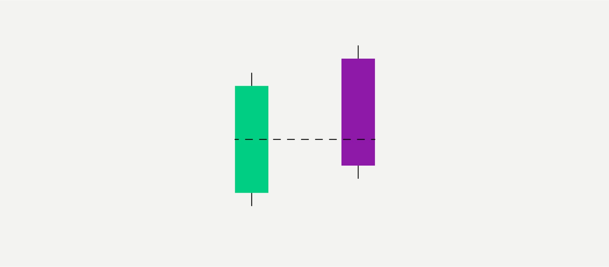
Bearish Harami Pattern
Our first bearish candlestick pattern is known as the “Bearish Harami pattern”. Like its counterpart, the “Bullish Harami pattern”, the Bearish Harami pattern is a reversal pattern, meaning that is indicating a possible reversal in price development.
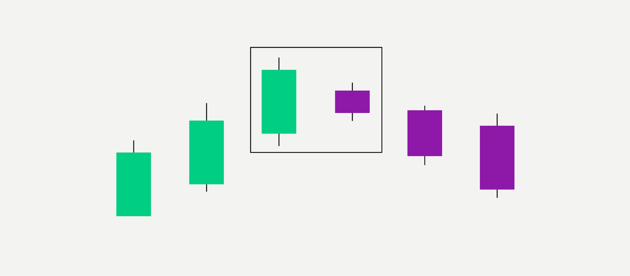
Contrary to the Bullish Harami pattern we described in our previous article, this time the two most significant candles in the Bearish Harami are at the top of the formation. The outlined green candle has a much wider range of “price action” than the following red candle, a “shortline candle”.
In this pattern, the dimension of the smaller red candle should not exceed 25% of the “real body” of the preceding green candle, which represents the price range within which an asset was traded in during a set day (or sometimes a different time span, depending on settings in a trading chart).
How can crypto traders interpret the Bearish Harami pattern? Together with the red candles succeeding the peak of the formation, this may be a sign that selling pressure will continue to increase and the market is about to enter a greater bear state. Just as a Bullish Harami pattern can predict new highs for an asset, a Bearish Harami formation can predict new lows.
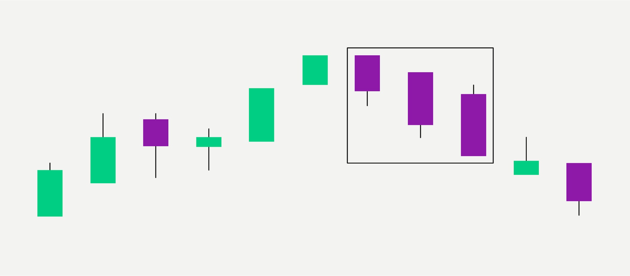
Three Black Crows Pattern
Another pattern indicating a bearish reversal is called The Three Black crows pattern. Again it is the opposite of a bullish counterpart - the Three White Soldiers pattern.
Here, the essential candles traders look for are the three red candlesticks, which usually have short wicks. They show the development of steadily increasing selling pressure and an increasingly lower closing price over the course of three days.
By the time this trend ends, the asset’s closing price will have dropped to a much lower level than before. The tiny green candle with the long shadow is called an “Inverted Hammer” or “Shooting Star''. It shows that the market did reach a high that day - but buying pressure was very low. The bears quickly took back control and drove the price back down. How can traders react to the Three Crows Pattern? They may conclude that selling pressure is greatly increasing, hence this pattern is likely to indicate a bear market looming ahead.
Advanced trading techniques
If you have mastered the fundamentals of cryptocurrency trading, you may be eager to explore more advanced strategies to maximise your potential returns. Bitpanda Fusion provides the advanced trading tools you need to manage high-volume trades seamlessly, efficiently and securely. From swift order execution to chart analysis, our advanced trading platform has everything an experienced trader needs to take their strategy to the next level.
Ready for advanced trading? Sign up for Bitpanda Fusion today.
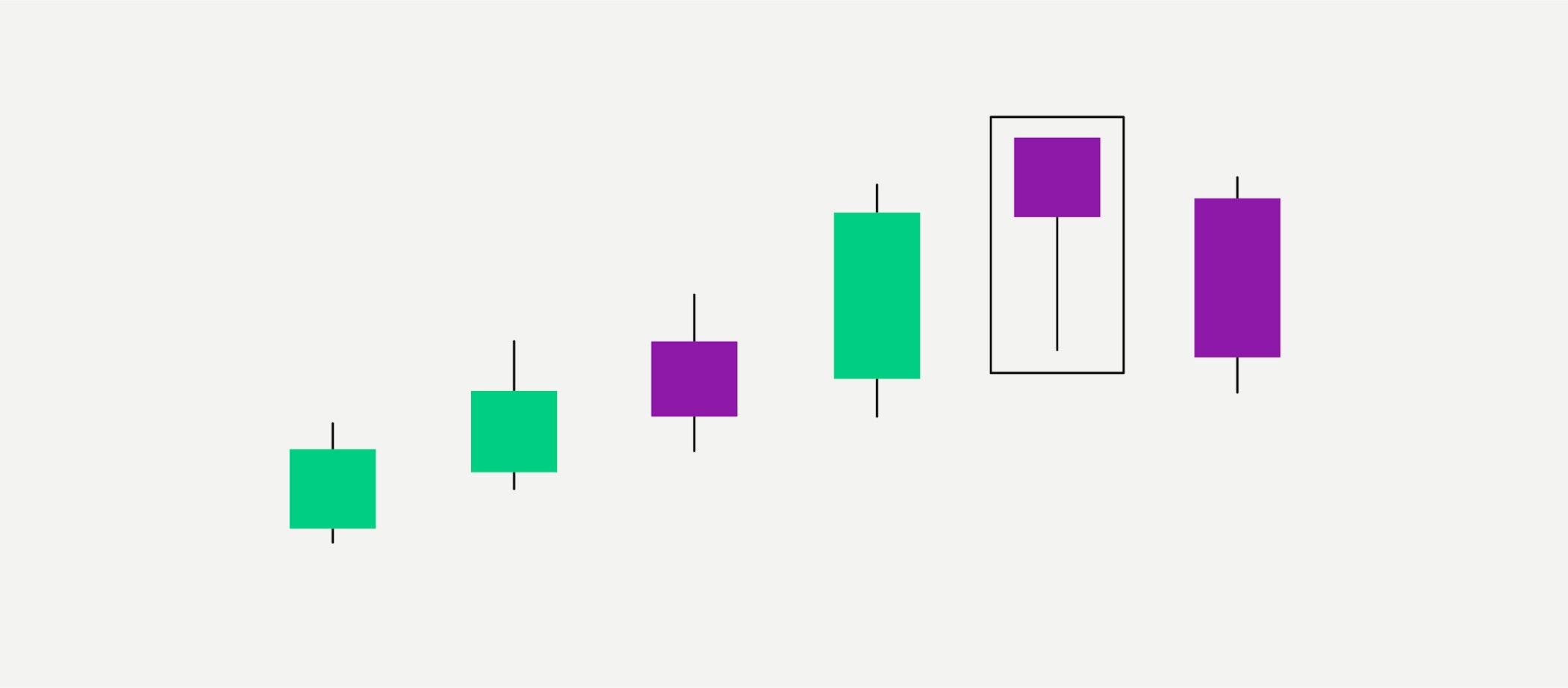
Get started nowFalling Three Methods Pattern
Like its bullish counterpart, the Rising Three Methods pattern, the Falling Three Methods pattern is a continuation pattern, most likely showing continuation of an existing trend.
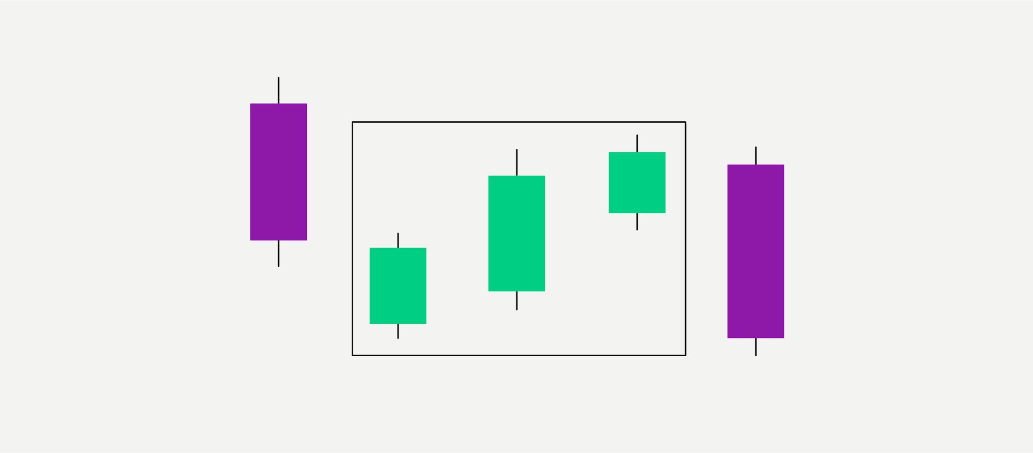
Honing in on the three green candles inside the circle we see that while a three-day bull market has occurred, the range of price movement has been decreasing steadily. Next, the final red candle shows a sharp drop in price movement, with an opening price that is identical to the previous day’s.
The three green candles may indicate a pause in a bear market with an asset bouncing back from extended selling pressure. However, the final red candle shows that the bears have regained sufficient control of the market to push the price down to new lows. Consequently, traders generally interpret the Falling Three Methods pattern as a sign that a short-term bull trend is ending and the asset is about to move into a greater bear market. Note here that unlike our previous examples, this pattern is not considered a reversal pattern because the asset’s upward price movement does not last long enough to be termed a “market.”
The Dark Cloud Cover Pattern
Don’t forget that cryptocurrency trading on crypto exchanges is often highly “short-term” trading at high frequency, hence we want to mention some candlestick patterns that are often used for analysis of shorter time frames.
The Dark Cloud Cover pattern shown below is one of the most popular short-term bearish reversal patterns used by traders.
Like its counterpart, the Piercing Line, is bullish, the Dark Cloud Cover Pattern is a bearish top reversal pattern or two-day trend reversal showing up towards the end of an uptrend. The second candle’s opening price is above the closing price of the green candle and closes beneath its midpoint, indicating an attempt that bulls were trying to push up the price but bears shifted the momentum towards selling, marking the start of a downward price trend.
The Hanging Man pattern
The Hanging Man Candlestick Pattern is a reversal pattern - it is usually an indication that a previously sustained upward movement comes to a halt and a downward trend is coming up.
This means that the asset itself must first be in an uptrend. Remember: once a high number of market participants concludes that the market has reached its highest levels this means that the “bears” now outweigh the “bulls” and mass selling pressure sets in. As a result, a candle appears at the top of the upward trend with a small body and a long shadow at the bottom.
Usually there is no no shadow towards the top or just a very small shadow. This pattern shows when increased demand has pushed up the asset price but selling was excessive and the price began to fall. In some cases, the Hanging Man also appears in the midst of a general uptrend and the upside may remain strong going forward.
Overall, bearish candlestick patterns support traders who are speculating on declining prices to profit from these by buying an asset, selling it and buying it back later at a lower price.
DISCLAIMER
This article does not constitute investment advice, nor is it an offer or invitation to purchase any crypto assets.
This article is for general purposes of information only and no representation or warranty, either expressed or implied, is made as to, and no reliance should be placed on, the fairness, accuracy, completeness or correctness of this article or opinions contained herein.
Some statements contained in this article may be of future expectations that are based on our current views and assumptions and involve uncertainties that could cause actual results, performance or events which differ from those statements.
None of the Bitpanda GmbH nor any of its affiliates, advisors or representatives shall have any liability whatsoever arising in connection with this article.
Please note that an investment in crypto assets carries risks in addition to the opportunities described above.